Consuming Power BI Content
The object of Power BI is to consolidate data from multiple sources and present it in a more visually compelling manner, using graphical elements such as charts and graphs. The Power BI service is the consumer end of the tool, which runs in the cloud and allows users to access the data published by designers. Power BI visuals are accessible from the cloud using any web browser or a mobile device, as shown in Figure 1-2.
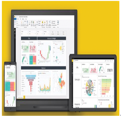
FIGURE 1-2 Visuals published in the Power BI service displayed in browsers and mobile devices
After a designer connects to a data source, creates Power BI content, and publishes it to the service, the connection to the source remains in place and the published data is updated automatically as the source data changes. Users can thus track information on a continual basis.
As with many of Microsoft’s cloud-based interfaces, the Power BI service displays are composed of multiple tiles. The Power BI home page, shown in Figure 1-3, contains tiles representing the user’s favorites and recently accessed elements by default, as well as a navigation menu on the left.
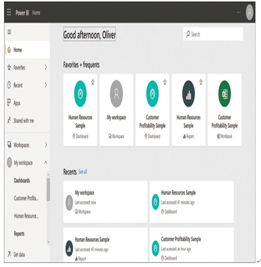
FIGURE 1-3 The Power BI home page
Using combinations of tiles, the Power BI service can display data in three basic formats: dashboards, reports, and apps, as described in the following sections.
Using Dashboards
The most basic type of display in the Power BI interface is the dashboard. A dashboard (sometimes called a canvas) is a one-page view, as shown in Figure 1-4, containing tiles drawn from one or more reports that tells a single story.
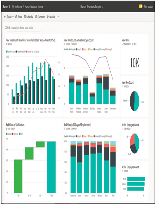
FIGURE 1-4 A Power BI dashboard displaying basic human resources information for a firm
After a dashboard is published in the Power BI service, consumers can interact with it in a variety of ways. For example, clicking a tile opens the report from which the tile was taken. Hovering the cursor over an element of a graph, as shown in Figure 1-5, displays the actual data value represented.
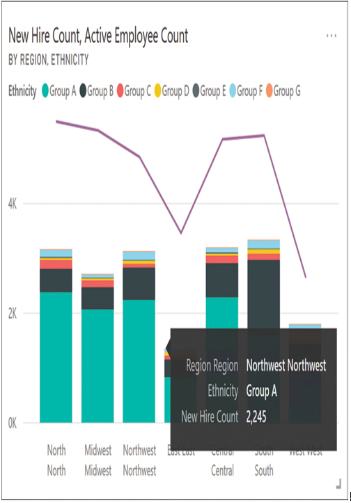
FIGURE 1-5 A bar graph from a Power BI dashboard with the value of a single data point displayed
Using Reports
A report is typically a multipage document that provides a more complete picture of a particular subject. By default, when a user opens a report in the Power BI interface, the main navigation pane collapses and a Pages pane appears, containing a list of the pages in the report, as shown in Figure 1-6. When you click a tile in a dashboard, the associated report opens to the page containing that tile.
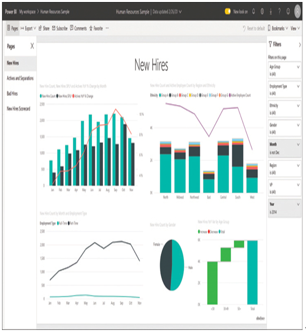
FIGURE 1-6 A Power BI report containing four pages of human resources information for a firm
Reports can contain a great deal of information, so Power BI has controls that can refine the displays that appear. For example, using the Filters pane on the right allows users to configure the display to contain only data conforming to specified categories, such as dates and locations. Designers can incorporate bookmarks into reports that provide alternative views of the same data sets. Consumers can create their own bookmarks also.
Using Apps
In Power BI, an app is a collection of dashboards and/or reports that designers can package as a single content element for distribution to consumers, as shown in Figure 1-7. The advantage of app packaging for consumers is that by installing a single app, users can gain access to many dashboards and reports at once, all of which are available in one place.
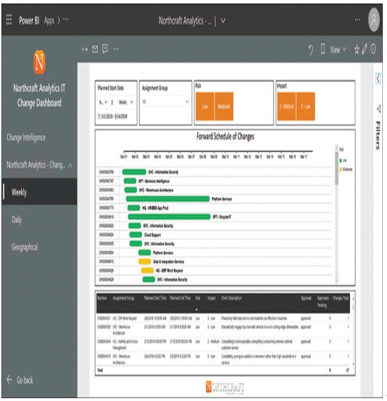
FIGURE 1-7 A Power BI app containing multiple reports
Note Using Apps
The use of apps with Power BI requires a Power BI Pro license. The basic (free) Power BI license provides users with limited consumer capabilities. The (subscription-based) Power BI Pro license, in addition to supporting apps, provides additional capabilities, such as allowing users to share dashboards and subscribe to dashboards and reports. The Power BI Premium license is intended for large organizations and provides dedicated service capacity and huge amounts of storage. As of this writing, the Power BI Pro license is US $9.99 per month and the Power BI Premium license is US $4,995 per month.
